在現代網頁開發中,互動性是吸引用戶目光與提升使用體驗的關鍵。大多數動態效果,例如滑鼠追蹤、點擊放大或拖曳,幾乎都仰賴 JavaScript 來完成。
但你是否曾想過:不使用任何 JavaScript,僅靠 SCSS(Sass 的語法擴充)就能實現滑鼠位置的偵測與互動效果嗎?
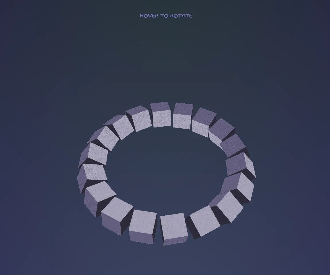
本篇文章將介紹如何使用純 SCSS 技術,透過創意與技巧,實現滑鼠位置「模擬偵測」,並打造具備 3D 旋轉與視差感的互動效果。
為什麼要用純 SCSS 偵測滑鼠位置?
- ✅ 減少對 JavaScript 的依賴:降低開發維護成本,減少潛在 Bug。
- 🚀 提升效能:在靜態頁面中減少不必要的腳本載入。
- 🔧 簡化流程:使用 CSS 預處理器統一管理邏輯與樣式。
SCSS 滑鼠位置偵測的原理
.cam {
  pointer-events: auto; // 接收滑鼠事件
}
.content {
  pointer-events: none; // 讓事件穿透到底層感應區塊
}
此屬性控制元素是否能接收滑鼠事件。在本技術中,我們會讓一組透明網格 .cam 元素覆蓋畫面,當滑鼠移入其上方,就能觸發對應的 CSS 動畫。
SCSS 自定義變數與運算
透過 @for 迴圈結合 nth-child,可計算每一個 .cam 對應的座標索引,再將這些索引轉為角度,用來旋轉 .content 容器:
@for $i from 1 through 20 {
  @for $j from 1 through 20 {
    $key: ($i - 1) * 20 + $j;
    &:nth-child(#{$key}) {
      &:hover ~ .content {
        transform:
          rotateX(($i - 10) * 6deg + 60deg)
          rotateY(($j - 10) * 6deg);
      }
    }
  }
}
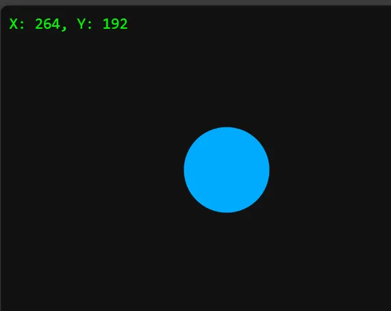
利用 CSS Variables(須配合JS)
    :root {
      --mouse-x: 0;
      --mouse-y: 0;
    }
    body {
      &:before {
        content: "X: " + var(--mouse-x) + ", Y: " + var(--mouse-y);
      }

    }
範例
<!DOCTYPE html>
<html lang="zh-Hant">

<head>
  <meta charset="UTF-8">
  <title>滑鼠座標顯示</title>
  <style>
    :root {
      --mouse-x: 0;
      --mouse-y: 0;
    }

    body {
      margin: 0;
      padding: 0;
      height: 100vh;
      background-color: #111;
      color: #0f0;
      font-family: monospace;
    }

    body::before {
      content: "X: " attr(data-x) ", Y: " attr(data-y);
      position: fixed;
      top: 10px;
      left: 10px;
      color: #0f0;
      font-size: 18px;
      z-index: 9999;
    }

    .box {
      width: 100px;
      height: 100px;
      background: hsl(200, 100%, 50%);
      position: absolute;
      top: calc(var(--mouse-y) * 1px);
      left: calc(var(--mouse-x) * 1px);
      transform: translate(-50%, -50%);
      border-radius: 50%;
    }
  </style>
</head>

<body>
  <div class="box"></div>

  <script>
    document.addEventListener('mousemove', (e) => {
      const root = document.documentElement;
      root.style.setProperty('--mouse-x', e.clientX);
      root.style.setProperty('--mouse-y', e.clientY);
      document.body.setAttribute('data-x', e.clientX);
      document.body.setAttribute('data-y', e.clientY);
    });
  </script>
</body>

</html>